10 AI Logo Maker Mistakes to Avoid (+ Pro Troubleshooting Tips)
The Perfect Logo Paradox: Why Your AI Creations Sometimes Miss the Mark
Every entrepreneur dreams of a logo that captures their brand essence in a single glance. In today's fast-paced digital world, you don't need to spend thousands of dollars or wait weeks for a designer's first draft. Using an AI logo maker has become the go-to solution for startup founders and content creators who need professional results quickly.
However, you might've noticed that some AI-generated designs look a bit "off" or amateur. Why do some logos look world-class while others fall flat? This is the "perfect logo paradox." The technology is incredibly powerful. But, if you don't guide it correctly, you avoid landing with a design that misrepresents your brand.
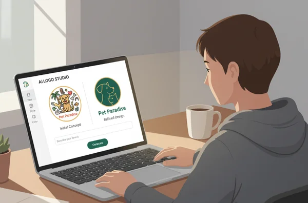
Take "Startup Sarah," a tech entrepreneur who initially struggled with a messy, cluttered graphic. By simplifying her prompts in our AI logo maker, she fixed her branding in just five minutes. Now, her startup looks like a million-dollar company. You're not alone in your frustration if you've seen blurry icons or clashing colors. Let’s break down the 10 most frequent AI logo design pitfalls—and exactly how to solve them.
By using the AI logo designer, you'll learn to create a visual identity that stands out. Whether you’re building a tech empire or opening a local bakery, these tips ensure your logo is professional.

Troubleshooting AI Logo Design Issues
When you first start using an AI tool, it’s tempting to click "generate" and hope for the best. While our ai logo design platform is highly intuitive, a few design principles make a massive difference. Let’s look at the most frequent errors and how to solve them in seconds.
Overcomplicated Designs That Lose Impact
One of the biggest errors is trying to say too much in one tiny icon. AI sometimes adds too many elements when given broad or heavy prompts. Requesting too many elements (e.g., "mountain, sun, river") creates a cluttered logo. The result? A messy icon that becomes unreadable on social media profiles.
Minimalism is your best friend in modern branding. To fix a cluttered design, use specific and restrictive prompts. Instead of a long list, try a prompt like "minimalist mountain icon, clean lines, geometric." On our platform, you can leverage style filters like "Minimalist Geometry." These guide the AI toward a simpler, more impactful aesthetic. Remember, the most famous logos—like Apple or Nike—are incredibly simple.
Poor Color Psychology Choices
Colors aren't just decorative; they tell a story. A common mistake is choosing random combinations that don't align with your brand values. For example, using neon pink for a high-end law firm confuses customers. If colors don't match your industry's "vibe," people will subconsciously distrust your brand.
Use a strategic approach to color. Before you create logo with ai, think about the emotions you want to trigger. Blue represents trust; green represents growth; yellow represents energy. Our tool allows you to select specific palettes like Cool, Warm, or Grayscale to ensure consistency. Explore our guide to logo color psychology to see which shades fit your mission.
Inconsistent Brand Messaging
This happens when the logo’s visual style contradicts the business's actual purpose. Imagine a "Retro Futurism" style for a company selling handmade baby clothes. The messaging is inconsistent. When AI generates a logo that doesn't represent your industry, the input keywords were likely too vague.
Refine your prompts with specific industry keywords. Tech startups should use precise prompts like "innovation" or "sleek." This steers the AI toward designs that reflect your brand’s cutting-edge vibe. If you're a productivity creator, try "organized" or "modern." By providing clear context, you ensure the output matches your identity. You can generate logo options multiple times with slight variations to find the perfect fit.
Advanced Troubleshooting: Technical & Creative Optimization
Once you've mastered the basics, you might still run into creative hurdles. These advanced issues separate a "good" logo from a "great" one. Here is how to handle the complex aspects of logo design.
Scaling Issues: Why Your Logo Fails in Print
A logo might look stunning on your laptop but fail on a business card. This is common with "3D" or "Gradient" styles that have too much fine detail. When you try to print it on a small pen, it becomes pixelated. If the file format isn't right, resizing the logo ruins the quality.
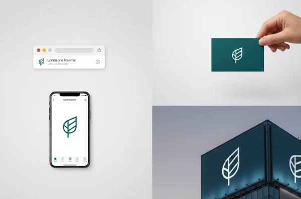
Always check design complexity if you plan to print. For professional use, you need high-resolution files. Our platform offers high-res exports in PNG and JPG formats. To ensure perfection everywhere, we're also introducing SVG (Scalable Vector Graphics) support soon. This allows you to scale your logo from a favicon to a billboard without losing clarity.

Font Mistakes
Typography is the "voice" of your brand. Many users choose fonts that are too thin to read or too decorative to be professional. A "Playful" font might work for a toy store, but it undermines a financial consultant's authority. Another mistake is using a font with the same visual weight as the icon, making the design look "flat."
Contrast is key. Use our curated font library to find a typeface that complements your icon. If your icon is bold, try a cleaner, lighter Sans-Serif font for the name. If you use our ai business logo maker, pay attention to the hierarchy. The brand name should stand out more than the slogan. If a font is hard to read, don't be afraid to select a different style like "Elegant" or "Modern."
Balancing Uniqueness & Clarity
There's a fine line between "unique" and "unrecognizable." Some users try so hard to be different that the icon no longer relates to their business. Conversely, using only generic prompts like "house for real estate" results in a logo that looks like every other competitor.
The secret is "Familiarity with a Twist." Start with a recognizable concept but add a unique prompt. Instead of just "house," try "geometric house with negative space leaf." This keeps the industry context clear while making the design yours. Test our "Negative Space" filter for subtle artistry or "Hand Drawn" for organic charm—both add memorability to your logo. You can experiment with our AI logo maker tools to find that perfect balance.
Pro Tips for AI Logo Design Success
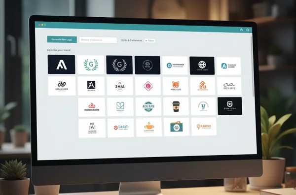
To get the most out of the best AI logo generator, you need to think like a creative director. Start by browsing successful designs in your niche. Don't just settle for the first result the free AI logo design tool provides. Instead, iterate.
Small tweaks to your adjectives can change everything. Use words like "bold," "minimalist," or "sophisticated" to refine the AI's direction. Also, consider the "white space" around your logo. A logo needs room to breathe to look professional on a website header.

Ready to turn your AI-generated concept into a polished brand asset?
Remember these key takeaways:
- Keep it simple so it scales well.
- Match your colors to your brand's emotional goals.
- Ensure your font doesn't compete with your icon.
- Use specific prompts to find a unique "twist."
Your logo is often the first impression a customer has of your business. It tells them if you're professional, modern, or creative. With these troubleshooting strategies, you've got the knowledge to guide the AI to success. Don't let common mistakes hold your brand back. Start your AI logo design journey with confidence today and build a brand you're proud to show the world!
Troubleshooting Your AI Logo Maker Results
Can AI really create professional-quality logos?
Absolutely. Modern platforms like AiLogoDesign.net use advanced neural networks to understand design principles. These tools generate unique logos for everyone from tech startups to local shops. The key is knowing how to guide the AI through prompts and style selections. When you use our tool, you're collaborating with an AI that's analyzed millions of successful designs.
How do I ensure my AI-generated logo is unique?
To make your logo stand out, avoid one-word prompts. Use specific, targeted descriptions that reflect your brand identity. Instead of "coffee," try "minimalist steaming coffee cup with a lightning bolt." Our AI logo maker generates multiple variations for every prompt. You can also mix different styles to ensure your final design is one-of-a-kind.
What file formats should I download?
The format depends on the use case. For web use or Instagram, a PNG file is best because it supports transparency. For general documents, a JPG works fine. If you're printing on merchandise, you'll eventually need a vector format like SVG. Our logo design ai currently provides high-quality PNG and JPG files, with SVG support coming soon.
Can I trademark an AI-generated logo?
In many jurisdictions, yes. However, since AI tools generate designs based on patterns, you should conduct a trademark search. Ensure your specific design isn't too similar to an existing brand. Our platform generates original designs from scratch, but we recommend final verification by a legal professional for global brands.
